By Arnab, Atharva & Lillian

Quick Summary
We wanted to see how people interact & explore a independent environment with minimal instructions. Explore different aspects of the box & create their own mental model. The idea was to create an experience contradictory to modern mobile applications overburdened by tutorials, inhibiting exploration.
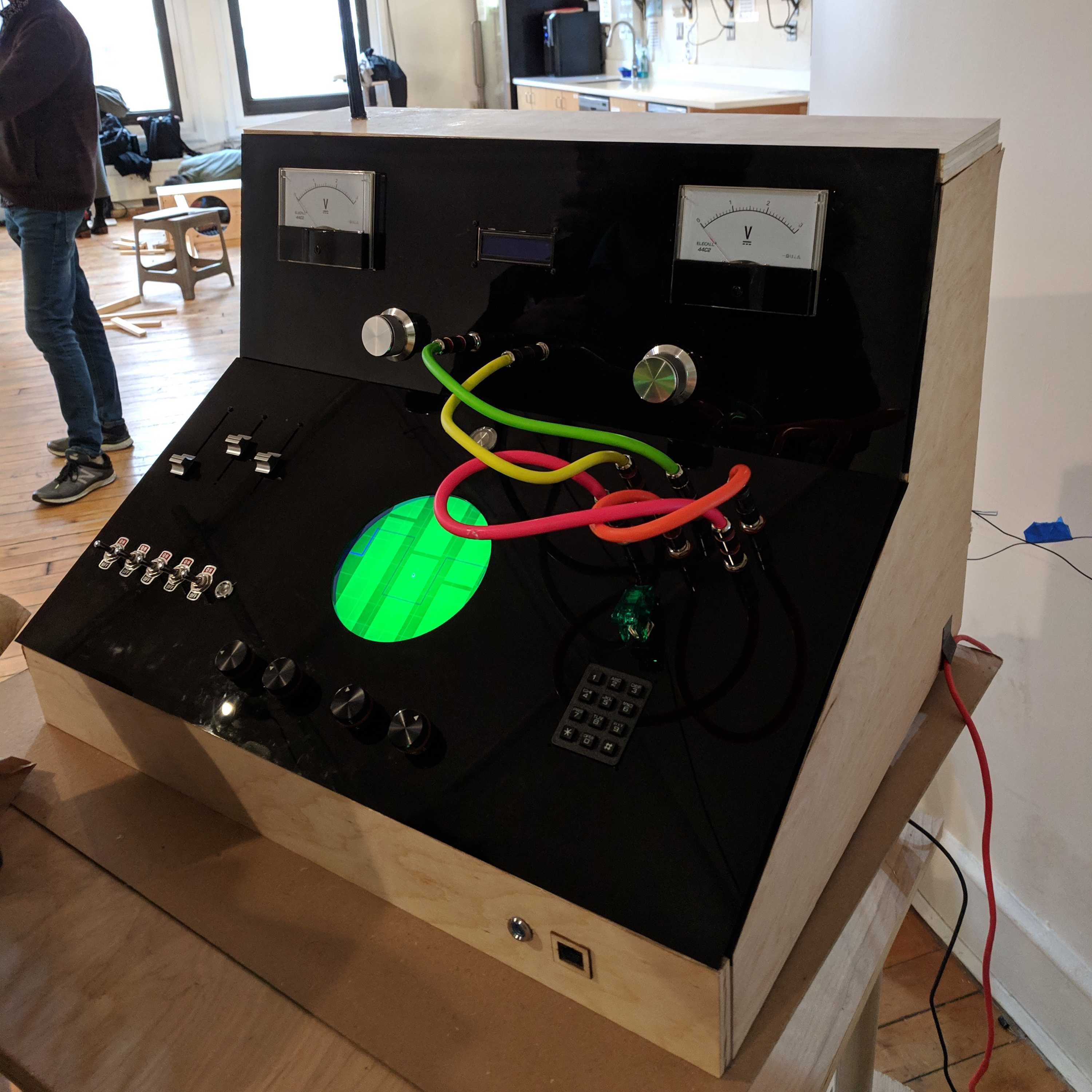
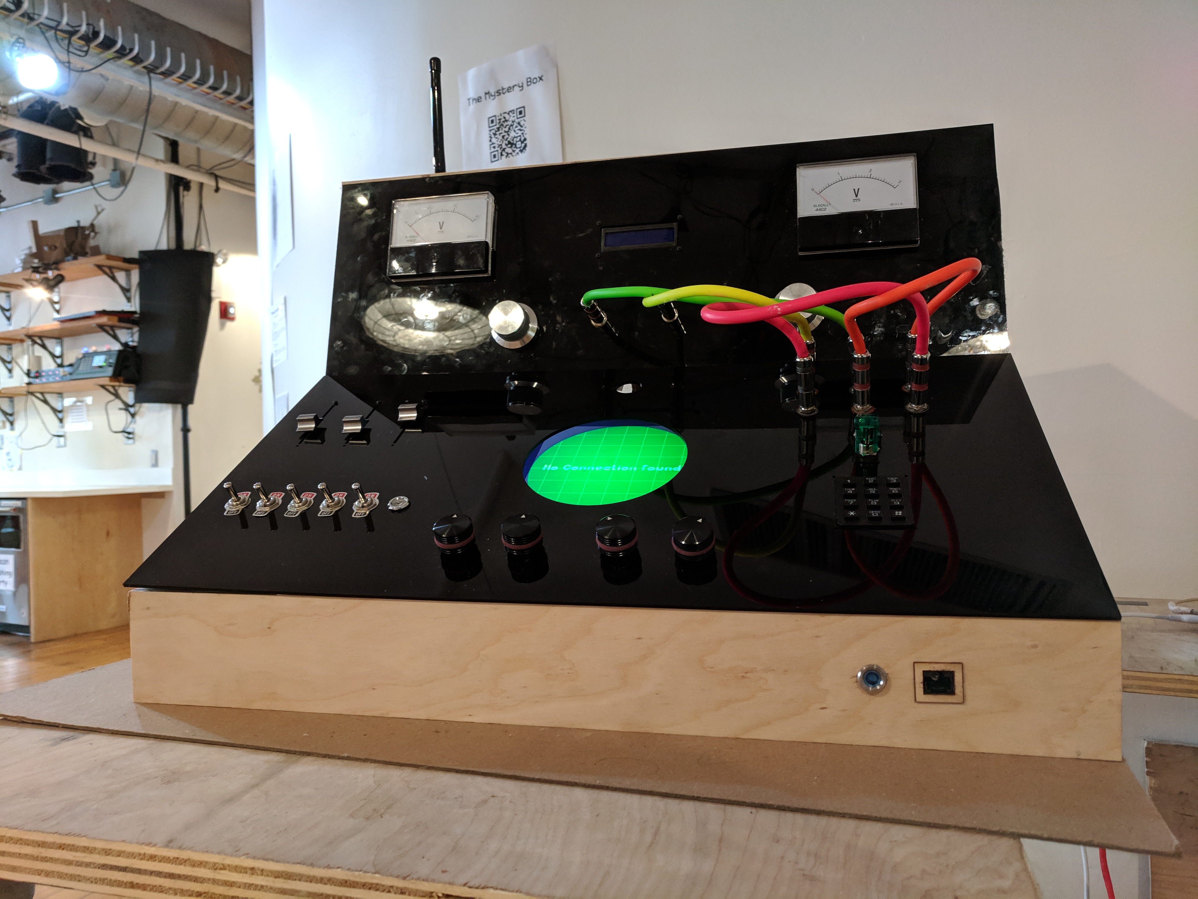
Thus the mystery box, a brainchild of three people who grew up playing arcade games. As part of our final physical computing class we teamed up to recreate some of those experiences & try to push the boundaries of the older tactile interfaces by blending them with a digital interface.
We even created a back story:
A evil genius Mr Orion has created a malicious software to destroy all cat videos from the internet. A fellow scientist Mr. Grotsky saw this impending doom & created a cure. He has mysteriously disappeared but, he did make sure the anti-virus was safely hidden inside the mystery machine guarded by intricate puzzles. You have discovered the box in his basement & your objective is to solve the puzzles in order to save the cat videos.
We discussed on what we wanted to build. A box with a lot of buttons which are part of a huge puzzle was the common consensus. But we still had a few questions around the interactions and the structure. We utilised the class play-test to answer these questions. We made a layout of our thoughts on a big cardboard and paper props.
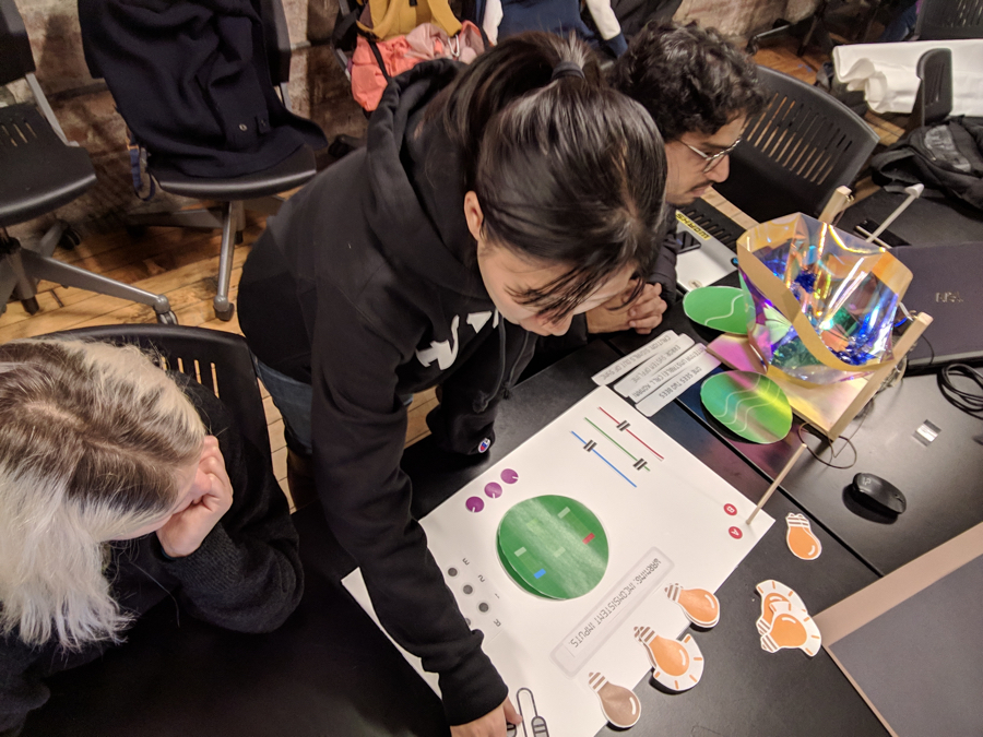
We gained some insights from the playtest:
1. The puzzles should be self contained without specific pop-culture references as our users won’t always be huge nerds.
2. People liked to explore different puzzles on their own. They were a little agitated if they couldn’t figure it out. But, were equally satisfied when they did figure a puzzle out.
3. Feedback was a important part of what actions they took next.
Based on this we finalised our concepts, created a bill of materials & started building the final piece.
We had 2 weeks to source components, fabricate, rig circuits, code & design puzzles. So, we divided our responsibilities with each of us leading one part of the making and the other two helping out.
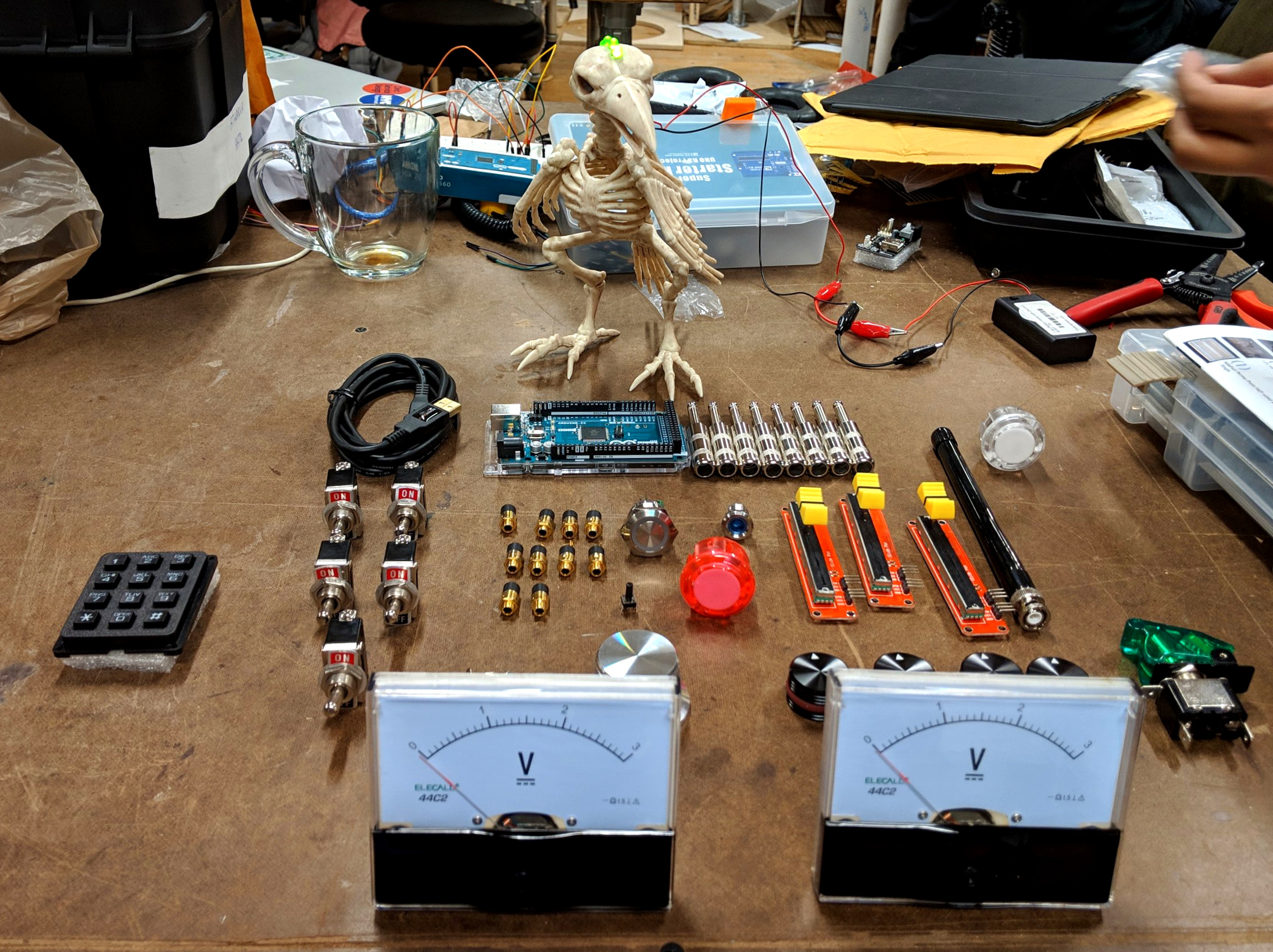
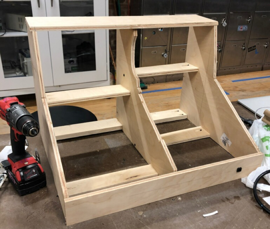
Arnab and Lillian got to fabricating the box, trying out different materials & layouts. We finalised the most ergonomic design & components layout based on the principles of visual design. You can read more about the fabrication process here.
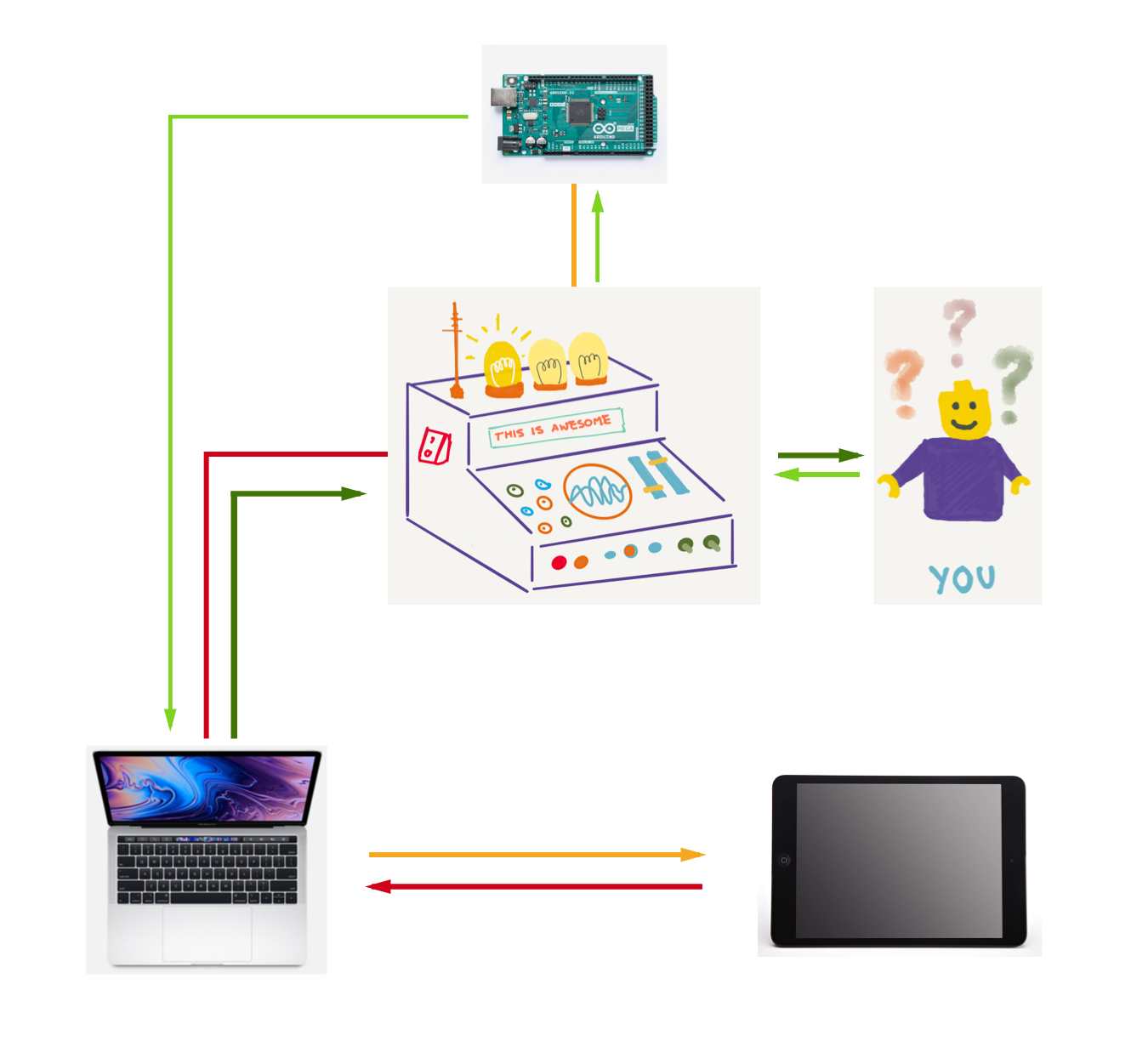
We broke it down into 3 smaller steps:
1. Creating different graphics & game logic using p5js, a javascript library for creating interactive visuals.
2. Building circuits & have them talking to Arduino, an Open-source electronic prototyping platform to create interactive electronic objects.
3. Finally, get the Arduino talking to the web-page with the puzzles via Serial Communication. Change webpage in response to user actions and simultaneously have them talking to the i-Pad display.
A visual representation would look like this:
#1 Based on our original mood-board we had an idea for the visuals we were looking for. We built out the different game levels using switch cases & success based on the right actions taken by the users.
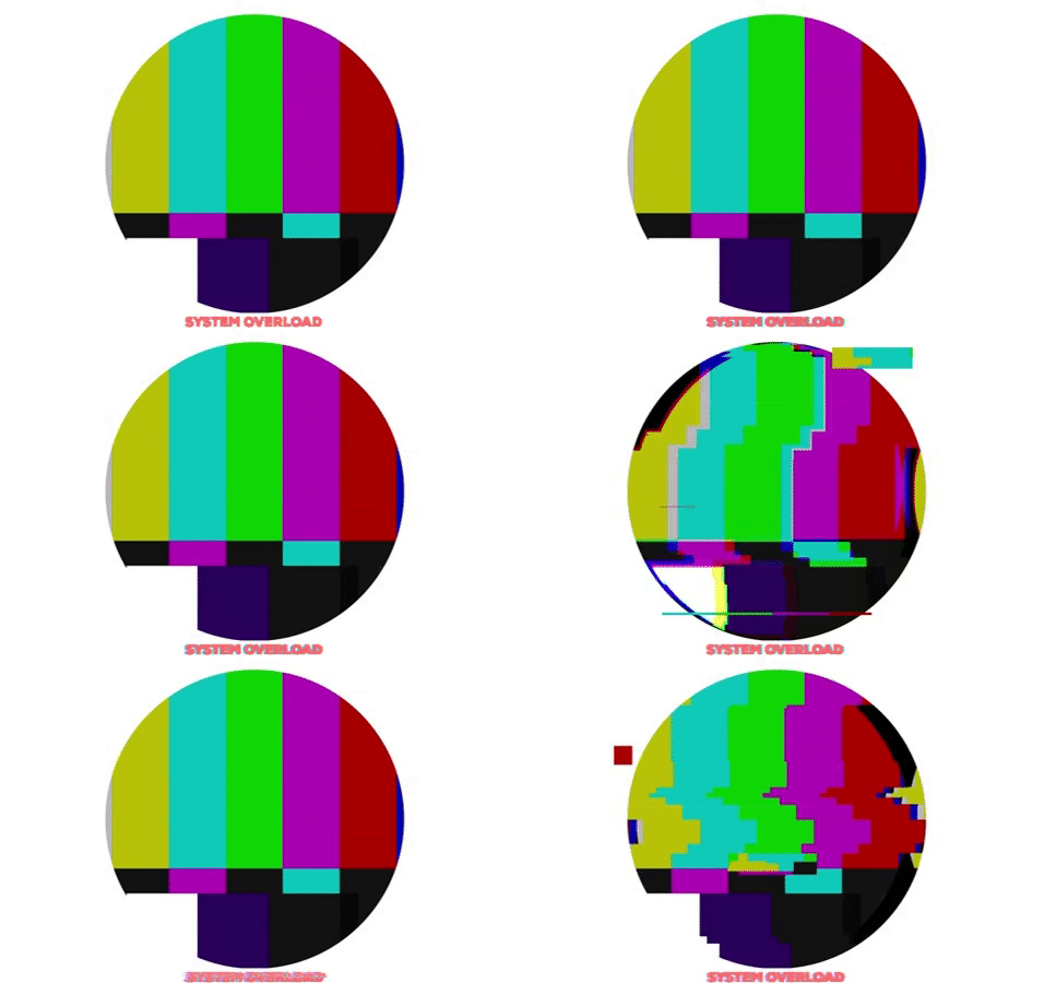
Some of the visuals and interactions
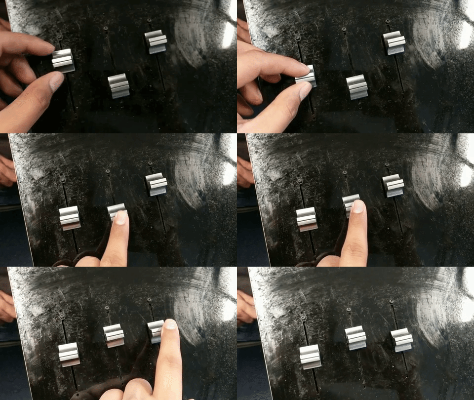
For one of the levels if someone moves the sliders
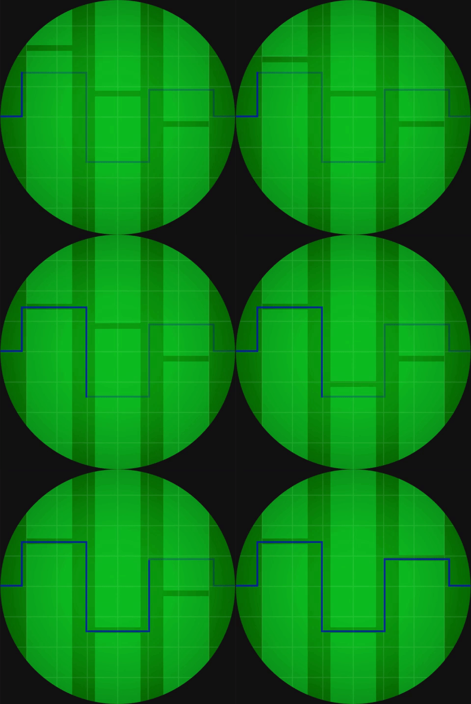
The response seen on the iPad screen is
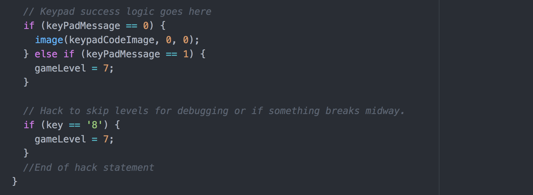
As a contingency hack we even built an hack to skip game levels by pressing keyboard keys in case anything went wrong.
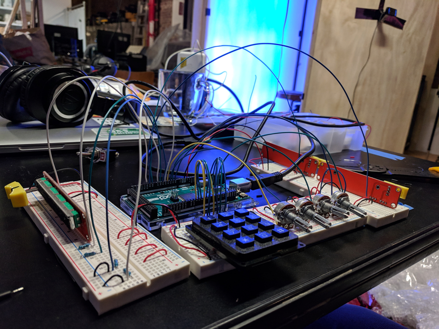
#2 We took the task of creating circuits one at a time. Making sure we were not making any errors/attenuations in the signals between Arduino & IDE Serial Communication. Creating individual circuits also helped us in visualising them independently in-case of a failure. After extensive tests we complied all the circuits & code to get the signals as an array of CSV's.
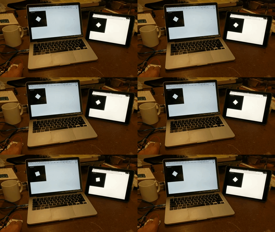
#3 Finally we used p5.serialport to create an interface between the digital screen & physical buttons. To extend the interfacing to i-Pad’s browser window we ran a local server on the laptop & opened the appropriate IP address + port on the i-Pad browser window.
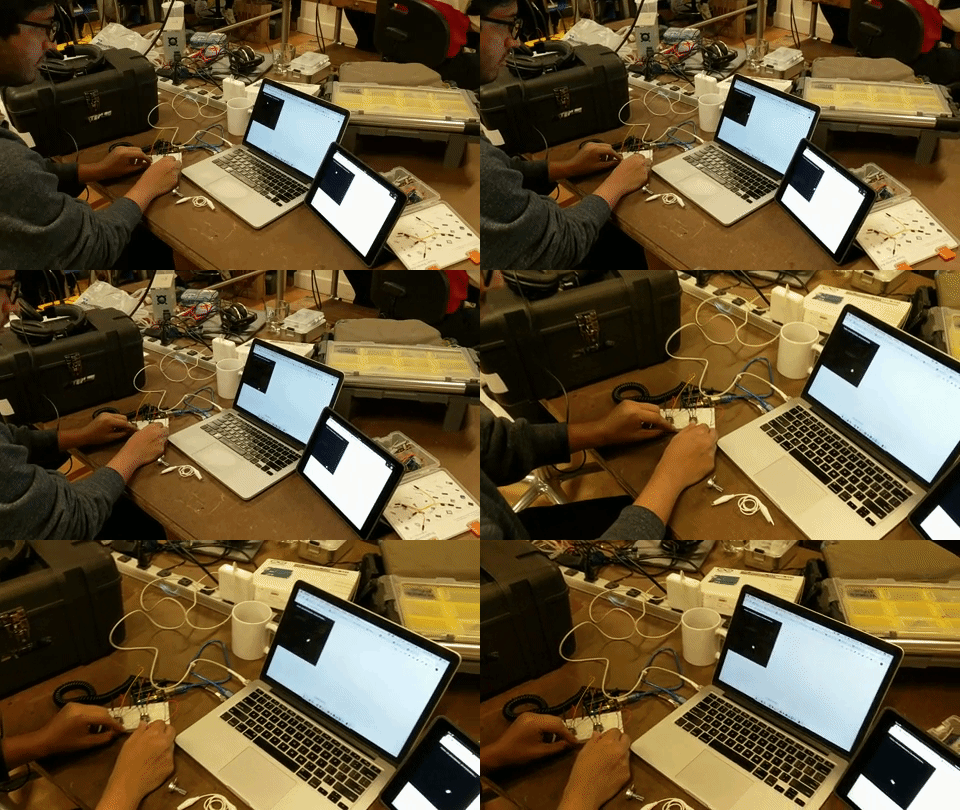
We expanded the same to multiple potentiometers & eventually to one of our puzzles.
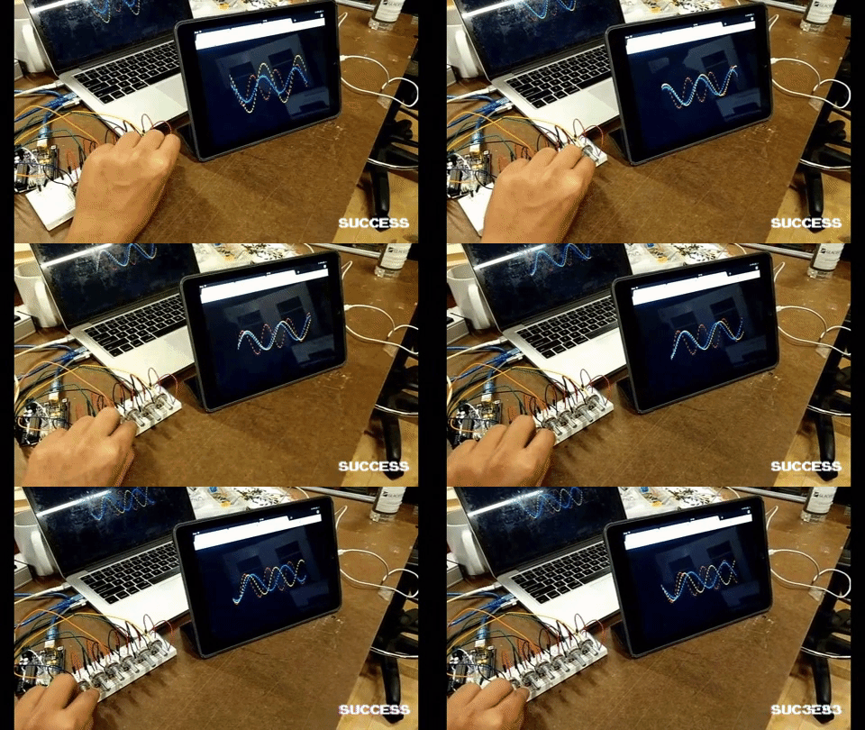
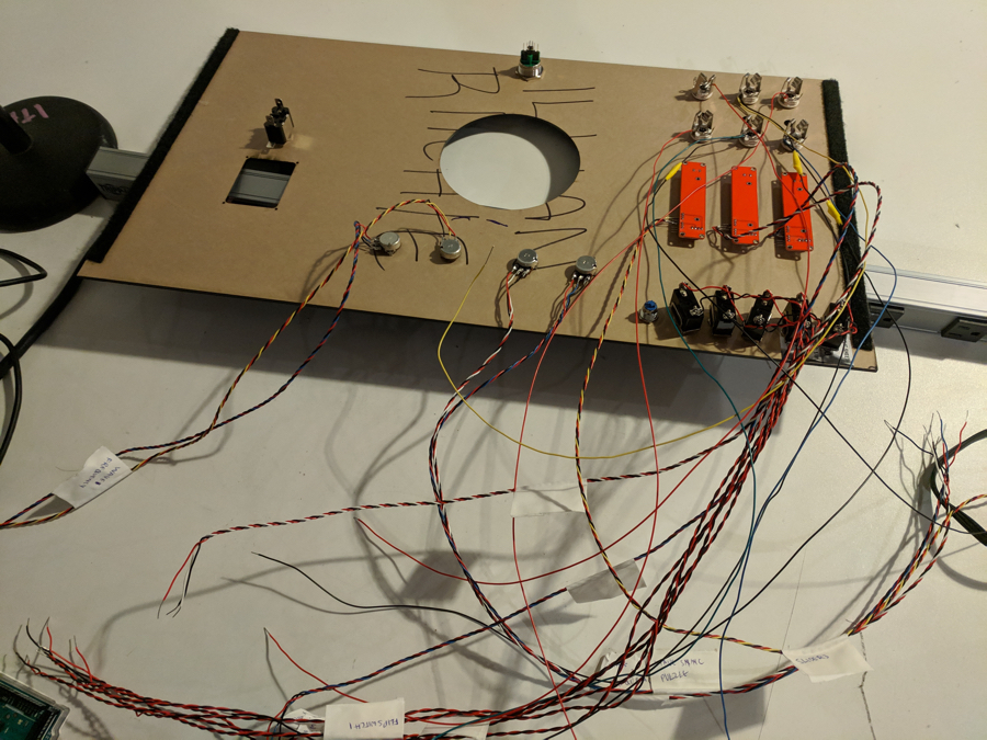
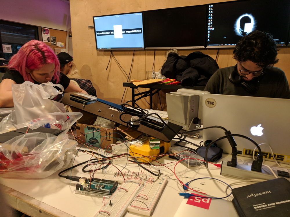
We had the proof of concept of individual pieces working. Finally it was time to put all of the code together, mount different components on the panel & finish up the final wiring.

You can find the source code here.
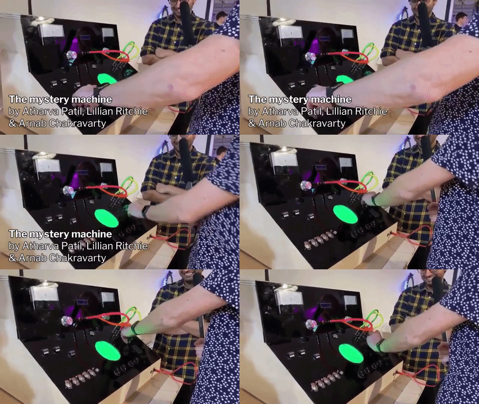
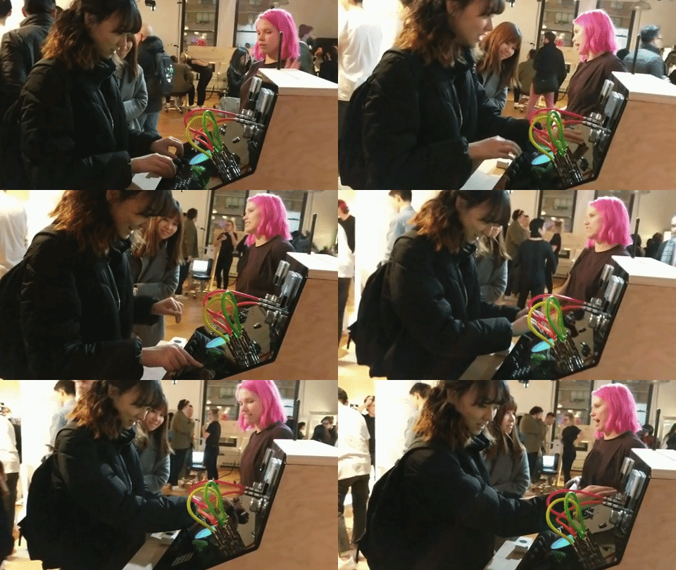
We got a chance to exhibit the box at the ITP Winter Show 2018. This turned out to be a massive user-tesing environment where people walk up & start interacting with our project. Over 100 people tried the machine over the course of 2 days. It was an amazing place to get good feedback and test out our original hypothesis.
As feedback we received appreciation for the fabrication & interactions.
We tested the box multiple times with our friends before we put it out for people to play with. We didn't anticipate people to be extremely rough. Repeated interactions of pulling out the headphone jacks(colourful wires), made the entire top panel to detach.
Luckily we had backdoor access so we let people keep playing while skipping the said level with broken circuits while we to fixed it. We couldn't as the damage was severe than anticipated.
We oberserved the interactions to be consitent with our hypothesis of intuitive explorations. With almost no hints people started creating their own mental models on how the puzzles work & an approach to solving them.
A lot of users tried to interact with the digital interface by swiping or tapping it in different places. This was an expected behavior with as smartphones with similar interactions dominate our daily life.
We expected more kids to walk up and play with the box due to it's flashy design. This was against our expectations. A probable hypothesis is lack of a prominent digital surface or the height of the platform being too high for children.
Our observations of people interacting & conversations with users helped us see the gaps where we could improve the overall experience.
1. Adding sound: Our original ideation & playtest included sound. With time limitations we didn't have time to do sound design. Sound was the secondary feedback which was an essential part of user experience. Including sound could have been a helpful addition
2. Self contained story: People loved the backstory which was simple and relatable to the masses. But looking at it as a installation they thought the story could be a part of the box. As we won’t be present to tell the backstory every single time.
When we saw people getting a hang of different interactions on their own with minimal guidance with made us re-think our original hypothesis of people being spoon-fed unnecessary tutorials to enforce specifc patterns. If many of the introductory tutorails are even necessary to users to get the job done? Should interfaces be desgined in more intuitive ways for people to understand? Or should there be standardised user interfaces for common actions?
Even though we were left with some open ended questions. We had a fun experience building the mystery machine as a group. Some of the classes we opted for were influenced by the kind of work we did building the box.
Wanna have coffee? Wanna collaborate? Wanna go to Kareoke? Have more questions about the box? Let's talk.

arnab@nyu.edu

atharva@nyu.edu

lillanritchie@nyu.edu